Creating an Image Placeholder with CSS
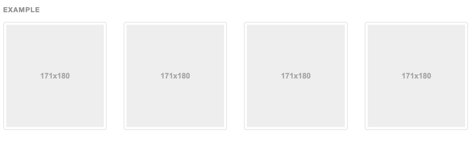
- 1 minIf you’re familiar with wireframes, mockups, documentation, etc. for web design then you’ve probably seen grey image placeholders to indicate where an image should go. If you go to Bootstrap’s documentation on thumbnails you’ll see exactly what I’m talking about.
 (Bootstrap)*
If you look at the Bootstrap websites’s source code, you’ll notice that their placeholder is an image. However it is quite easy to create you own HTML/CSS-based image placeholder with some simple styling.
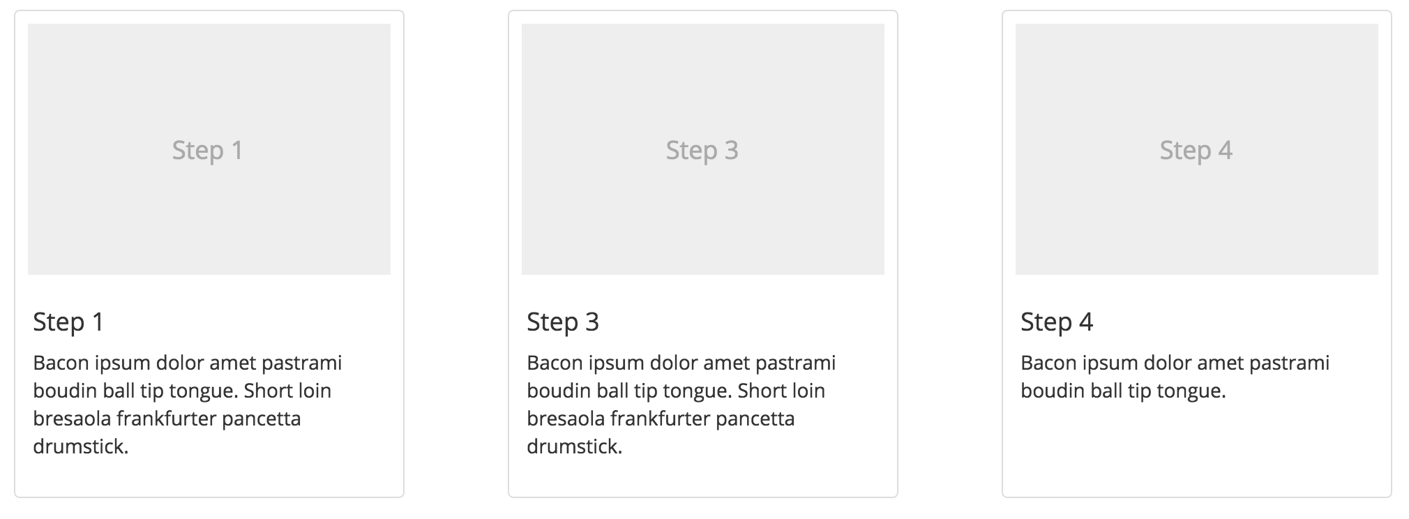
Structure
To get the nice grey box we need, all we need is a simple div. Then we can use a header (I used h4) or a paragraph or a span to write in some text. This will look like so:
<div class="image-placeholder">
    <h4>image placeholder text</h4>
</div>
Styling
You may notice that I gave the div a class name. This way I can apply all the styling I need to the div and its children. So all you need to do is set the div’s background color, and size, as well as the placement and color of the text. For my custom placeholder, my styling looks like so.
.image-placeholder {
    background-color: #eee;
    display: flex;
    height: 180px;
    margin: 5px;
    width: 260px;
}

.image-placeholder > h4 {
    align-self: center;
    text-align: center;
    width: 100%;
}
I used static values for my placeholder’s height and width, but you can replace these with percentages or em if you need to. The most important aspect of the styling is the use of display: flex. If you are unfamiliar with the flexbox styling, I encourage you to read this guide on flexbox. In short, setting a parent display to flex will automatically make its children “flex items” and you can easily format your elements along a row. One thing to note is that I had to tell the header to take up the entire width of its parent, since a flex item fits to its content by default.

Eric Su
MBA and software engineer building products for high-growth teams.